Friday, September 30, 2011

bear necessities

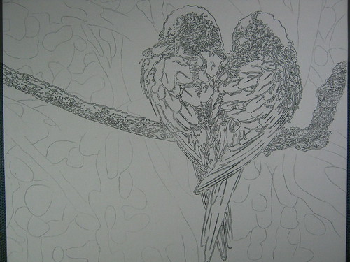
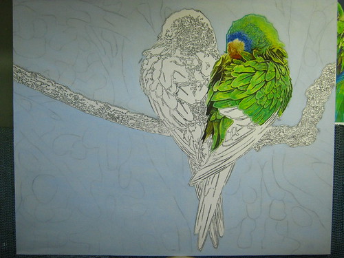
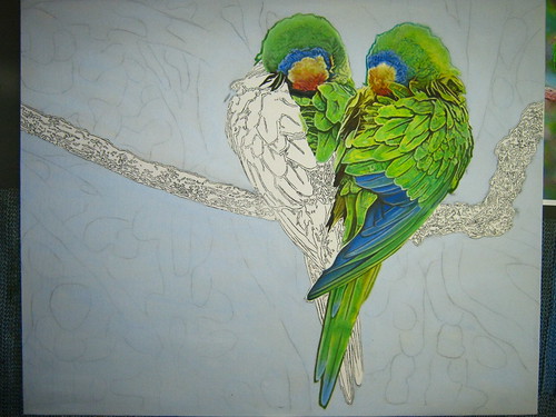
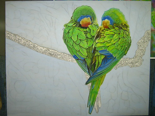
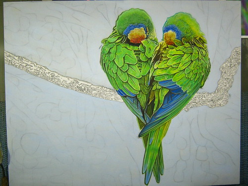
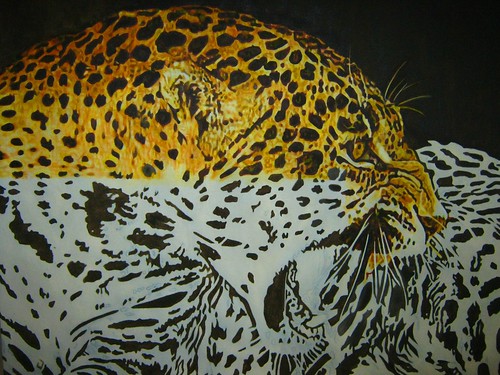
when the urge to draw / paint / create won't go away for months is the most wonderful feeling. i don't know if other artists feel this way but i just can't stand not drawing during these times. the only difficulty is having to ration the urge so that the "juice" wont run out during the last stages of the painting process. this inpired feeling really gives me the drive and patience i need to sit down for hours and paint.

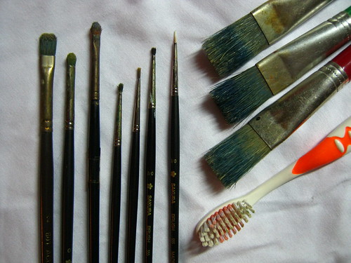
finding the right art materials is half of the fun too when creating art. sometimes new art materials can be an inspiration to create. for this and every painting that i've done so far i usually use five to six pieces of # 3/0 synthetic brush, # 0 & # 2 flat synthetic brushes, flat hog bristle craft brushes and other objects that can bring out the effect i'm looking for in a painting like the hard bristle toothbrush or assorted sponges.

Picture 058

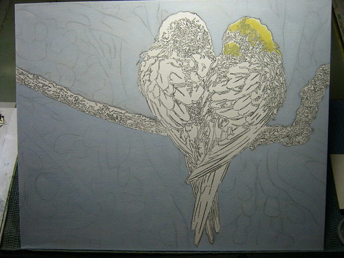
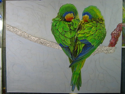
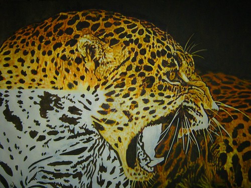
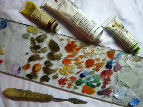
aside from this, i have my glass palette which i kept mentioning in my previous blog posts. in the following picture you can see how i mixed my color for the bear painting. i dont really have a system in placing my mixed oil paint on the pallette unlike some artists i've seen who place their oils in a rainbow like line. i usually clean my glass pallete a few weeks after a painting just incase i need a color chart to retouch parts of the painting. i also have my beloved pallette knife which fits my hand perfectly and has the right size in scoop length to mix my paint.

Picture 059

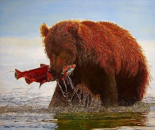
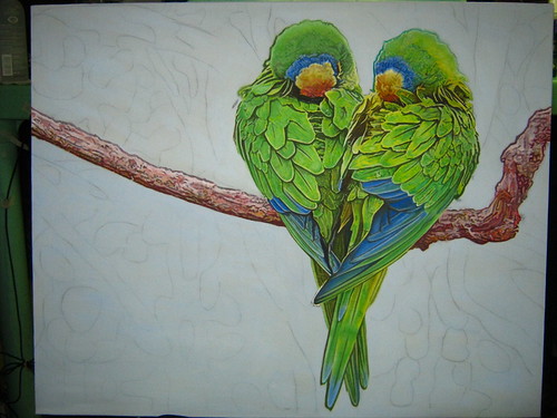
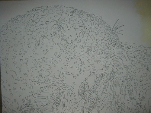
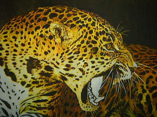
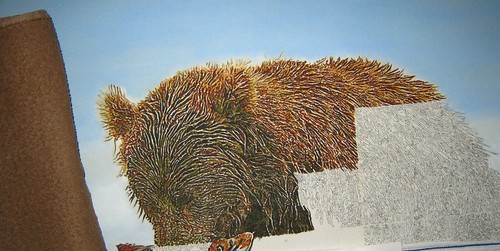
painting in my usual method, i've decided to skip over the parts where i show pictures on how i painted the sky, salmon and brown bear. the picture below shows how i work in sections on the bear fur. i paced myself setting a four by eight inch canvas space to paint quota per day. you can also see the brown towel i use to rest my arm while painting.

a

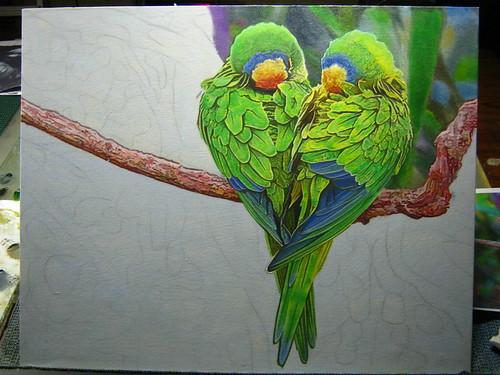
the most difficult part to paint was the water at first i thought i wouldn't be able to depict an accurate painting of the dripping, splashes and rippling of water but i'm glad to have pulled it off.


Picture 046

Picture 061


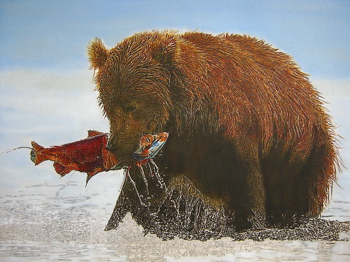
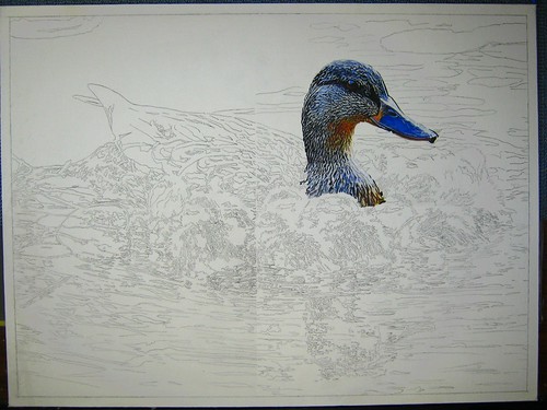
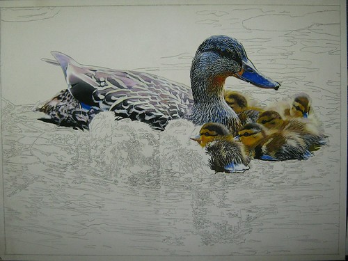
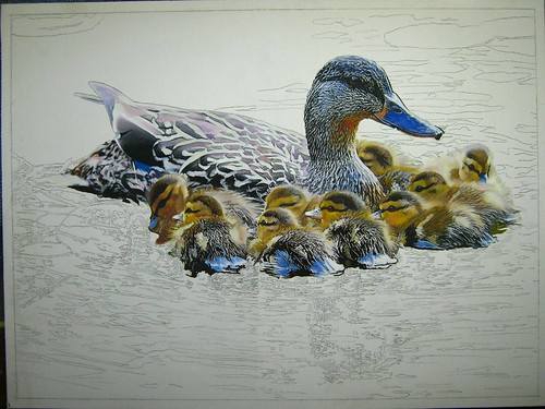
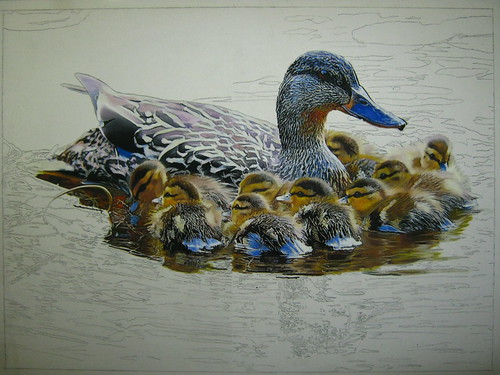
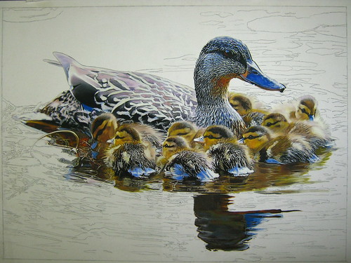
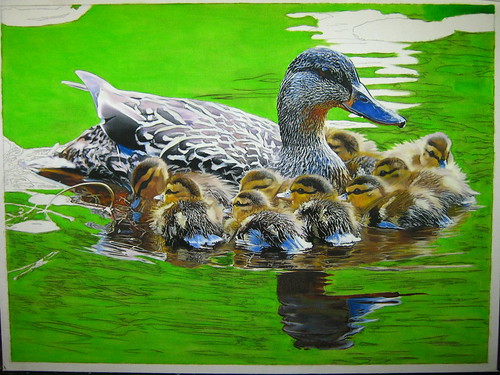
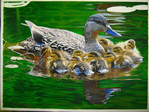
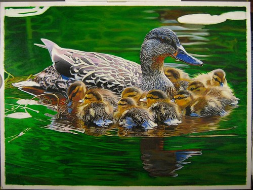
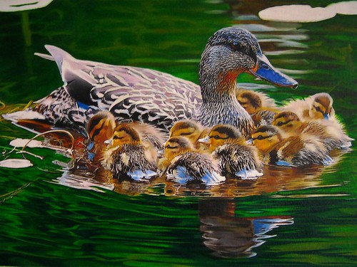
the final touches were of the water reflections which was a bit like my mama mallard painting. after one and a half months its finally complete ^_^v

f

Friday, May 6, 2011

two hearts in one

oil on 16" x 20" canvas panel. i'm back to having green hues on my palette but this time it's on a smaller canvas. originally i was going to paint this on my usual 18" x 24" canvas panel but close up birds on that size of canvas would be too big so i had to settle for a smaller sized panel. i won't be posting the species of the birds. i noticed that friends have been referring to them as parrots and others say it's a pair of lovebirds. so i thought: wouldn't it be great to create a mystery for my audience by not confirming any of their answers. ( this is me trying to show art that makes people think :p )

Picture 070

in my lethal look painting experiment i covered the canvas in a toned color first. i was very satisfied with the result and decided to do it again using a mixture of titanium white, payne's gray and french ultramarine but only on the background.

Picture 072

next step is the color test on the bird's head on the right. i find that picking out the right colors to use is the most difficult stage in a painting. once i knew i had the right hues everything fell into place.

Picture 073

Picture 074

Picture 075

the bird on the left took half of the time to paint than the bird ont he right since they're almost mirror images of one another.

Picture 076

Picture 077

Picture 078

painting the branch was lots of fun i applied the same techniques i invented during my fox cub background painting.

Picture 079

Picture 080

the final step is the painting of the background. i opted to put down all my tiny #3/0 sized detail brushes and used bigger sized #2 flat brush for a hazy impressionistic background of foliage. using a bigger brush would prevent me from putting in so much detail.

Picture 081

Picture 082

Picture 083

finally finished ^_^v

a

Friday, March 18, 2011

lethal look

oil on 18 ” x 24 ” artist canvas panel. after painting “ pair of rabbits”, “ mama mallard” and forbidden fruit” i kinda got tired of painting green. not that there is anything wrong with the color. i just wanted a different set of color hues on my glass palette. so i went with hues of yellows, oranges, reds and browns ang thought it would make a nice change. with this in mind i ended up painting a portrait of a snarling jaguar.
Picture 040
after drawing the jaguar in pencil i decided to try something new. based on an idea i got from reading whatever international artist or leisure painter magazine i could buy. in some articles, artists would talk about their process of painting in their desired medium in detail. from this i got the idea of toning the canvas with one color to unify all the colors in the painting. i experimented with this and toned my canvas with a thin glaze of light naples yellow hue then i waited for the whole canvas to dry before proceeding to the next step.
Picture 041
the result made my pencil markings hazy so i decided to block in the darker parts of my painting before anymore details are lost. the last time i blocked in a painting with a darker color first was when i painted my seaturtle painting. this process seemed appropriate with this type of painting but unlike the seaturtle painting i used burnt umber color instead black. lately, i find myself shying away from black. i think i was because i read in an article that there isn’t anything really black on earth because of all the bouncing of light and color and somehow to me this made sense.
Picture 042
next i did a color test on the eyes then proceed painting the jaguars nose then facial fur, ears, teeth then body. my style in paintings as you would have noticed by now is the "by section" type. as you can see on the pictures i’ve divided the jaguar in half and painted the upper part first. this is due to my aversion of using easels especially when i’m painting the top part of the canvas. for me painting the upper part on an easel even with the use of a mahl stick is like exercising with your arms stretched out. after 5 to 10 minutes of this my arm start to ache so much that i can’t paint anymore! usually i paint on an inclined drawing table and when i’m painting the upper part of the canvas i usually put a towel on the lower part of the canvas so that i wont smudge the pencil marks.
Picture 046
Picture 049
Picture 051
the lower half is still painted on an inclined drawing table and the towel is folded as i paint towards the left part of the canvas.
Picture 053
Picture 057
i painted the tongue and jaw for last because this requires a different set of color and there wasn’t enough space again on my glass palette. this jaguar portrait kinda reminds me of my snow leopard painting. both of them show only the head and half of the body. if you haven’t noticed yet i have a different style in painting fur. i don’t lke to paint every strand. i always thought that painting every strand of fur makes the fur look poofy. Even though my paintings are said to be realistic-like i paint impressions of fur and it can be seen clearly on this painting when viewed live and up close. :p
Picture 059

Tuesday, January 25, 2011

forbidden fruit

my first finished painting for the year 2011. yehay! i heard that in some countries raccoons are considered to be pests cause they break into homes and garbages and do all sorts of damage. in the philippines we don't have raccoons running around so we view them as sly and cute critters.
Picture 002
after putting down all the guide details i need. i usually do the color test on the actual painting because i don't like painting the same thing twice. this way the subject becomes more interesting because there will be a lot of colors on the board during this experiment period. the beauty with oils as a medium is that you can never go wrong. if you want to change color just let the part dry and put a new coat of paint on top.
Picture 006
this is my first time to draw apples. i guess i could also pass for a still life fruits painter because friends have commented on how life like the apples are.
Picture 007
painting the leaves one by one by one was really a patience tester. although i had a lot of fun playing around with yellow, green and blue hues. i was careful not to make the leaves in the foreground look lumped together. i wanted them to stand out individually. it took four times longer to paint the foreground leaves than to paint the raccoon and branches combined.
Picture 020
Picture 027
Picture 036
the branches were the last to be painted cause my palette was filled with so many leaf colors. finally finished ^_^
Picture 039

Friday, October 8, 2010

mama mallard

From one subject to two subject rabbits then ten cute ducks!
My process in painting is the same as before, starting with penciling in all the guidelines. this way would make me think and worry less about the placement of the subjects when i'm applying paint. i prefer to concentrate on what color to mix for my subject. and as always i begin with painting the main subject, mother duck. i wanted her feathers to look slightly coarse so i struggled a little while painting her feathers.
Img_0063
the duckling on the right was my test subject on which colors i would be using. after a series of trial and errors i found what colors best suit in the painting. after this the rest of the ducklings was easy to paint.
Img_0085
Img_0087
IMG_0089
after the ducklings, i immediately started painting the reflection so that the leftover paint from the ducks can still be used before they dry up on my glass palette.
IMG_0091
i painted on a yellow green wash all over the background to unify the colors.
IMG_0093
painting the water ripples starting from the upper right to left was harder than i thought. i was going fo a slightly blurred background then a much sharper foreground and was having a hard time translating this idea into the canvas.
Img_0106
the next step was to define the details and adjust the color values.
Img_0101
end result. yay!
Img_0114

Thursday, July 22, 2010

bunny burrow

It’s been a while since my last post. As much as I want to escape reality and immerse myself in painting, certain household chores and people with authorities always get n the way. It took me twice the time to finish this painting.
pair of rabbits 1
I began with putting in as much pencil detail as I can with a mechanical pen. after this I started putting in the oil paint colors. starting with the rabbit on the right side, I played around with the colors burnt umber, titanium white, flesh and yellow ochre tones to get the result that are to my taste.
pair of rabbits 2
This is the first time I’ve painted two subjects in an oil painting. I thought it would feel more homely if there where two of them in the burrow since rabbits live in groups. I made the second rabbit (the female rabbit) darker to depict it still inside the burrow where as the other one (the male rabbit) was slightly out. Its like he’s protecting the female and their home.
pair of rabbits oil painting
I didn’t take as many pictures as I would have I liked while painting the background. I sold my camera and was in the market for an upgraded one. Just like the seaweeds in the lionfish painting I painted the grass clockwise starting from the top right. It took more hours for me to complete the background than to paint both rabbits. I had fun while painting and I’m glad its finished ^_^

Wednesday, April 7, 2010

snow leopard

this 18" x 24 " oil painting of a snow leopard wasn't really in my project to do list. my original plan was to make an amur leopard. this means using a lot of yellow, orange and brown colored paints, warm colors in short. this past month (march 2010) was so hot i decided to make a snow leopard instead. at least, i'll be using "cool" colors in my painting. (its a psychological thing)

Photobucket

as usual, i start with the eyes, then the nose and ears while trying to make the fur look a bit scruffy and coarse, outdoor cats can't look too groomed.

Photobucket

i didn't really know how to draw scruffy fur. so the method you see here was done by trial and error. it took me a while to figure out how to do it too.

Photobucket

the fur at the back and sides of the leopard must have a coarse look while the chest and belly parts have a silkier look.

Photobucket

i chose to blur the background because the snow leopard is already very detailed. having a background that has more details would make the painting unbalanced.

Photobucket

with my experience from painting logs on the fox cub canvas, it was easier to paint the chopped of log under the snow leopard's paw. here's the finished painting ^_^v

Photobucket