Saturday, May 18, 2013

snuggle bears


oil on 22x26 canvas panel. aside from my main subject i wanted to show a bit of the cold and vast landscape of the polar bear's habitat in the arctic region.

q

i start by painting the clear blue sky background with one inch craft bristle brush. i noticed that i often find myself using this type of brush when i'm doing my backgrounds. i think this maybe my favorite brush to use in that area. :)

f

next i got to play around with some modeling paste for the snow's ground texture. i used the modeling paste to build up textured surfaces with this technique i achieved my soft chunky snow look. after this i proceeded working on the cub's face and did a bit of color testing in this area.

e

with all my colors figured out the rest of the bear's fur was easier to make. since i have a different way of painting fur i think i should start labeling my paintings as done in semi-pointillism style. up close it looks like a bunch of blurred dots but viewed from a far its rough outdoor fur. it has come to my attention that due to my different style in painting some people might think that the photo of my painting is grainy.

d

c

b

here's a look at the finished painting. :)

a

Monday, September 24, 2012

sos lynx

oil on 18x24 canvas panel. a campaign support piece i made to promote awareness on the critically endangered lynx and the sos lynx conservation in portugal. the original plan for this painting was to make it on a 22x26 panel but at the last second i changed my mind thinking that a large portrait style of an iberian lynx is too much. at that time i was thinking that large canvases would be much better if it was filled with at least 40% background scenery. this lynx project of mine has approximately 20% of the background showing so a smaller and narrow vertical canvas would be a better choice.

Picture 001

using the same ivory black paint from the "watching you" painting i start by blocking in the dark parts of the lynx. its a little funny when i do this part because with all the pencil details i make. it sometimes gets confusing on where to put in the dark blocks and more that one occasion getting frustrated at myself because i forgot what some of the pencil markings meant. but usually after figuring this part out its so much easier to fill in the rest of the colors.

Picture 002

painting the background first before the subject just to get out of my routine of starting a painting with the eyes. in the background i tried to create the impression of a sunny close up grassland. i didnt put in much detail here to balance the painting out because the lynx was already heavily detailed.

Picture 003

doing the color test starting with the mommy lynx's ear then going down and across the head. i used lots of mixes between lemon yellow, naples yellow hue, raw sienna, raw umber, payne's gray and titanium white. there are also some blue hued glazing in some parts.

Picture 004

Picture 005

painting the lynx cub's tongue and eyes last. this painting took thrice the time for me to finish. this probably is the longest time it took me to make a painting. there were lots of distractions and other prior commitments hopefully the next one will be a smooth sailing one.

Picture 006

Sunday, March 25, 2012

adapting

oil on 18" x 24" canvas panel. i find it interesting that i feel as if i've finished this painting in a remarkably short time. as i check my working time table records it seems that in the time i spent painting there was nothing out of the ordinary in the way i've paced myself compared to my other paintings. i guess this time i had a higher concentration level and i think i over estimated the time needed to overcome the possible painting obstacles i've forseen. 
in my haste to start the painting i've forgotten to take a pcture when it was still in pencil so here is the next best thing... in burnt umber blockings.

 Picture 011

i did my color test on the face first then on to the rest of the body. the palette colors i used are similar to the bunnies on my bunny burrow painting. i was aiming for a reddish brown fur instead of the usual ocher-tan.

Picture 013

next i worked on the grass starting from the upper right first going left. i've mixed some yellows and blues into the grass pigment for variety.

Picture 018

here the grass is almost done. only a twig and bits of earth to paint on the lower left part.

Picture 015

finished ^_^ i haven't used any black for this painting i'm still thinking on how dark i want my darkest hue on the painting to be. since i've only finished this painting a while ago i'll be thinking this over in  a day or two. i'll be updating is entry with a picture if i do.

Picture 019

Wednesday, February 29, 2012

watching you

back in black~ after choosing to paint without using black pigment for a while i felt that i kinda missed the color. although i know some combinations of other pigments that would give me a black tint, i've decided to consume my remaining tube of black oil paint before it goes stale. Here's a picture of my grumbacher ivory black before i started this project.

Picture 009

as i said earlier, i designed my next project to really use a lot of black paint. hopefully i get to consume the whole tube on this and have tons of fun.

Picture 001

starting with the eyes i wanted them to glow for a haunting look. i also tried to make the eyes intense, as if it was looking directly at the viewer. then i start with the color test on the upper left face furs.

Picture 003

after painting the fur, i decided to block in my black paint so i can have a sneak preview of what it will look like finished.

Picture 004

Picture 005

i repeat the same steps from the picture above to the lower part of the painting.

Picture 006

Here's of my ivory black grumbacher again, more than half of it consumed, too bad there's still 1/8 of paint left in the tube.

Picture 010

i wasn't able to take many pictures of the process but i had a blast ^_^

a


Monday, January 16, 2012

fishing king

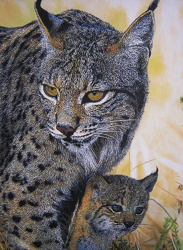
oil on 18 x 24 canvas panel. first painting finished for the year 2012!! hope this becomes a more painting productive year than the last one and hopefully i get to make lots of obra maestras (master pieces) too.
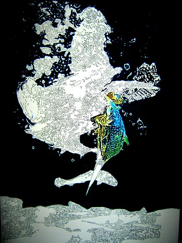
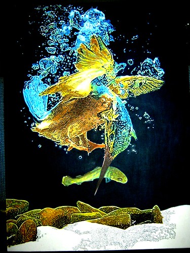
i started debating whether to paint this kingfisher on a 16x20 or a 18x24 inch canvas. the 18x24 won because i had more canvases in this size in stock than the 16x20. although the original idea was to paint a life sized azure kingfisher which is approximately 6 to 8 inches tall. a bird of this size and in my composition would still look small on a 16x20 canvas. as you can see i went with a larger than life scale ratio instead.
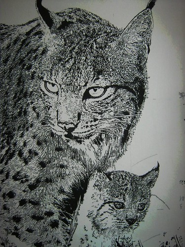
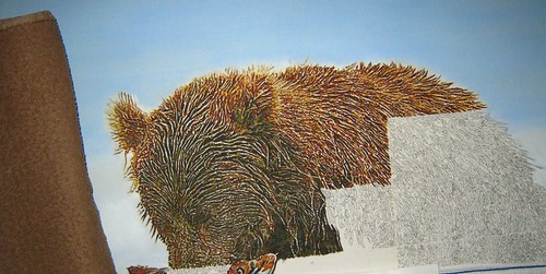
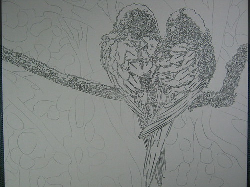
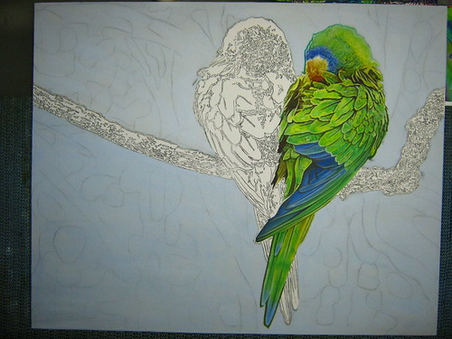
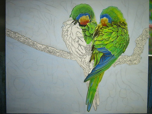
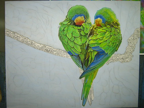
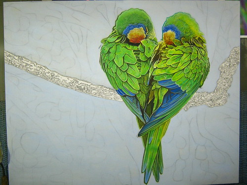
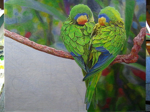
if you look closely, i made some mistakes around the early stages of penciling. usually making penciling mistakes on canvas are irreparable because no matter how much eraser you use the pencil marks will never be gone so its better you not try to use an eraser at all. thankfully, it was only a minor error and i didn't need to prepare a new canvas for a fresh start so i just flipped the canvas upside down and started again.
this is also the first time im painting in a vertical format for my oil painting collection.

Picture 138

choosing the right background color went through quite a lot of color changes. at first i used a mixture of french ultramarine and thalo green but it turned out to be too light in shade so i chose payne's gray as a top coat. i was aiming for dim aquarium lighting so i needed a dark bluish green background. at this stage i also covered up most of penciling mistakes from earlier too.

Picture 139

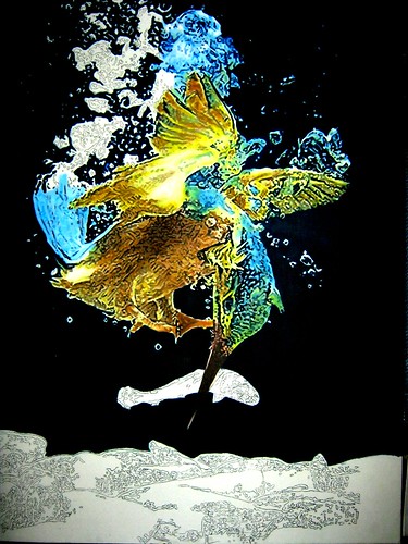
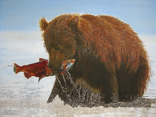
i chose the dim aquarium lighting mood to highlight the kingfisher's decent into the water to catch its prey. adjusting the real color of the azure kingfisher with warm yellow lighting was a fun experiment.

Picture 140

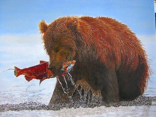
with all the right color mixtures in place it was easy to paint the rest of the body. using cerulean blue, cobalt blue, permanent green light with titanium white painting the bubbles was easy.

Picture 144

Picture 146

choosing color for the caught fish was a bit tricky since this is an underwater scene with dim yellow lighting the fish scales would be bouncing all sorts of color. i thought it would be fun to portray the fish to be somewhat translucent and glowing.
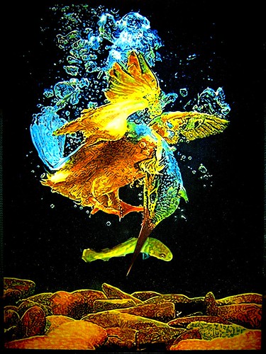
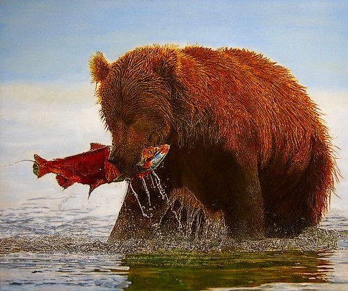
the last time i painted stone texture was on my curious kitty painting. instead of using sponges for texture again i decided to use colors instead. unlike the curious kitty painting the stones in this composition was close up and i think the sponges would not be able to bring out the textures i have envisioned. i think i did alright starting with the top most stone on the left going to the right.

Picture 149

the last stages in my painting usually involves a lot of glazing to adjust the light and dark of color hues. finally finished.

n

Friday, September 30, 2011

bear necessities

when the urge to draw / paint / create won't go away for months is the most wonderful feeling. i don't know if other artists feel this way but i just can't stand not drawing during these times. the only difficulty is having to ration the urge so that the "juice" wont run out during the last stages of the painting process. this inpired feeling really gives me the drive and patience i need to sit down for hours and paint.

finding the right art materials is half of the fun too when creating art. sometimes new art materials can be an inspiration to create. for this and every painting that i've done so far i usually use five to six pieces of # 3/0 synthetic brush, # 0 & # 2 flat synthetic brushes, flat hog bristle craft brushes and other objects that can bring out the effect i'm looking for in a painting like the hard bristle toothbrush or assorted sponges.

Picture 058

aside from this, i have my glass palette which i kept mentioning in my previous blog posts. in the following picture you can see how i mixed my color for the bear painting. i dont really have a system in placing my mixed oil paint on the pallette unlike some artists i've seen who place their oils in a rainbow like line. i usually clean my glass pallete a few weeks after a painting just incase i need a color chart to retouch parts of the painting. i also have my beloved pallette knife which fits my hand perfectly and has the right size in scoop length to mix my paint.

Picture 059

painting in my usual method, i've decided to skip over the parts where i show pictures on how i painted the sky, salmon and brown bear. the picture below shows how i work in sections on the bear fur. i paced myself setting a four by eight inch canvas space to paint quota per day. you can also see the brown towel i use to rest my arm while painting.

a

the most difficult part to paint was the water at first i thought i wouldn't be able to depict an accurate painting of the dripping, splashes and rippling of water but i'm glad to have pulled it off.


Picture 046

Picture 061


the final touches were of the water reflections which was a bit like my mama mallard painting. after one and a half months its finally complete ^_^v

f

Friday, May 6, 2011

two hearts in one

oil on 16" x 20" canvas panel. i'm back to having green hues on my palette but this time it's on a smaller canvas. originally i was going to paint this on my usual 18" x 24" canvas panel but close up birds on that size of canvas would be too big so i had to settle for a smaller sized panel. i won't be posting the species of the birds. i noticed that friends have been referring to them as parrots and others say it's a pair of lovebirds. so i thought: wouldn't it be great to create a mystery for my audience by not confirming any of their answers. ( this is me trying to show art that makes people think :p )

Picture 070

in my lethal look painting experiment i covered the canvas in a toned color first. i was very satisfied with the result and decided to do it again using a mixture of titanium white, payne's gray and french ultramarine but only on the background.

Picture 072

next step is the color test on the bird's head on the right. i find that picking out the right colors to use is the most difficult stage in a painting. once i knew i had the right hues everything fell into place.

Picture 073

Picture 074

Picture 075

the bird on the left took half of the time to paint than the bird ont he right since they're almost mirror images of one another.

Picture 076

Picture 077

Picture 078

painting the branch was lots of fun i applied the same techniques i invented during my fox cub background painting.

Picture 079

Picture 080

the final step is the painting of the background. i opted to put down all my tiny #3/0 sized detail brushes and used bigger sized #2 flat brush for a hazy impressionistic background of foliage. using a bigger brush would prevent me from putting in so much detail.

Picture 081

Picture 082

Picture 083

finally finished ^_^v

a